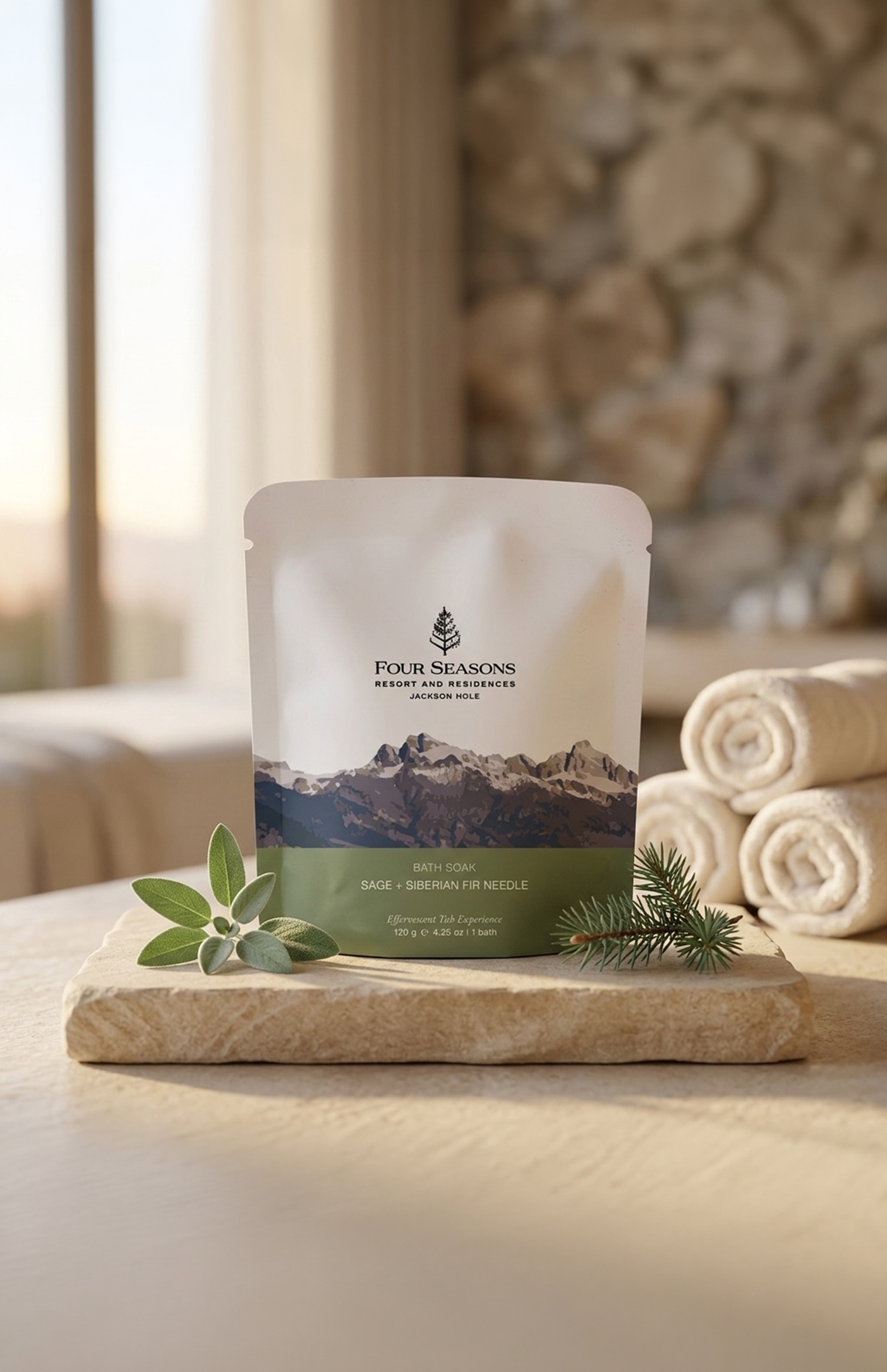
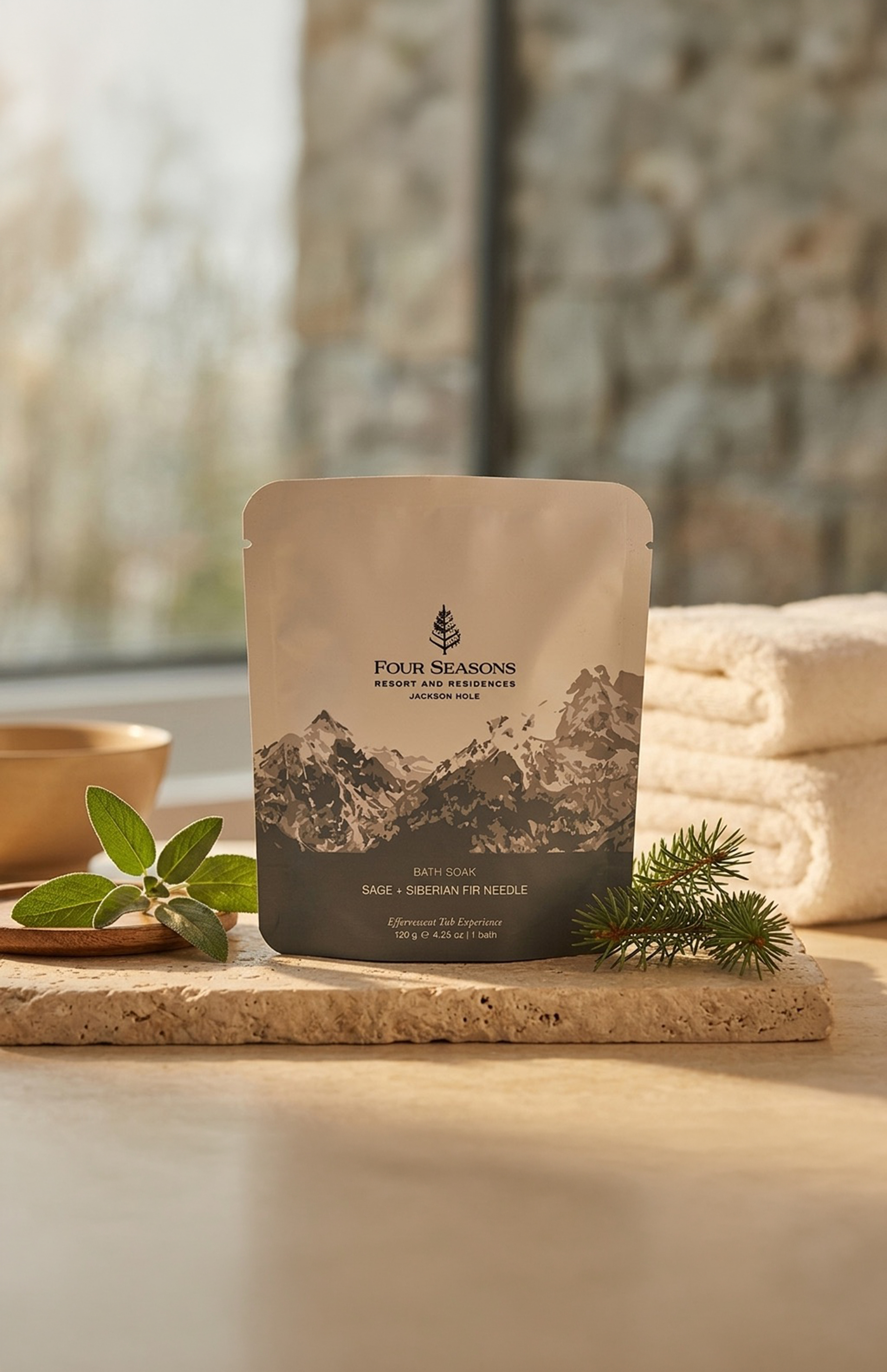
This project focused on developing a refreshed private label packaging direction for Four Seasons under Bathorium. The objective was to explore how the product line could evolve visually while maintaining alignment with both Bathorium’s premium positioning and the established identity of Four Seasons.
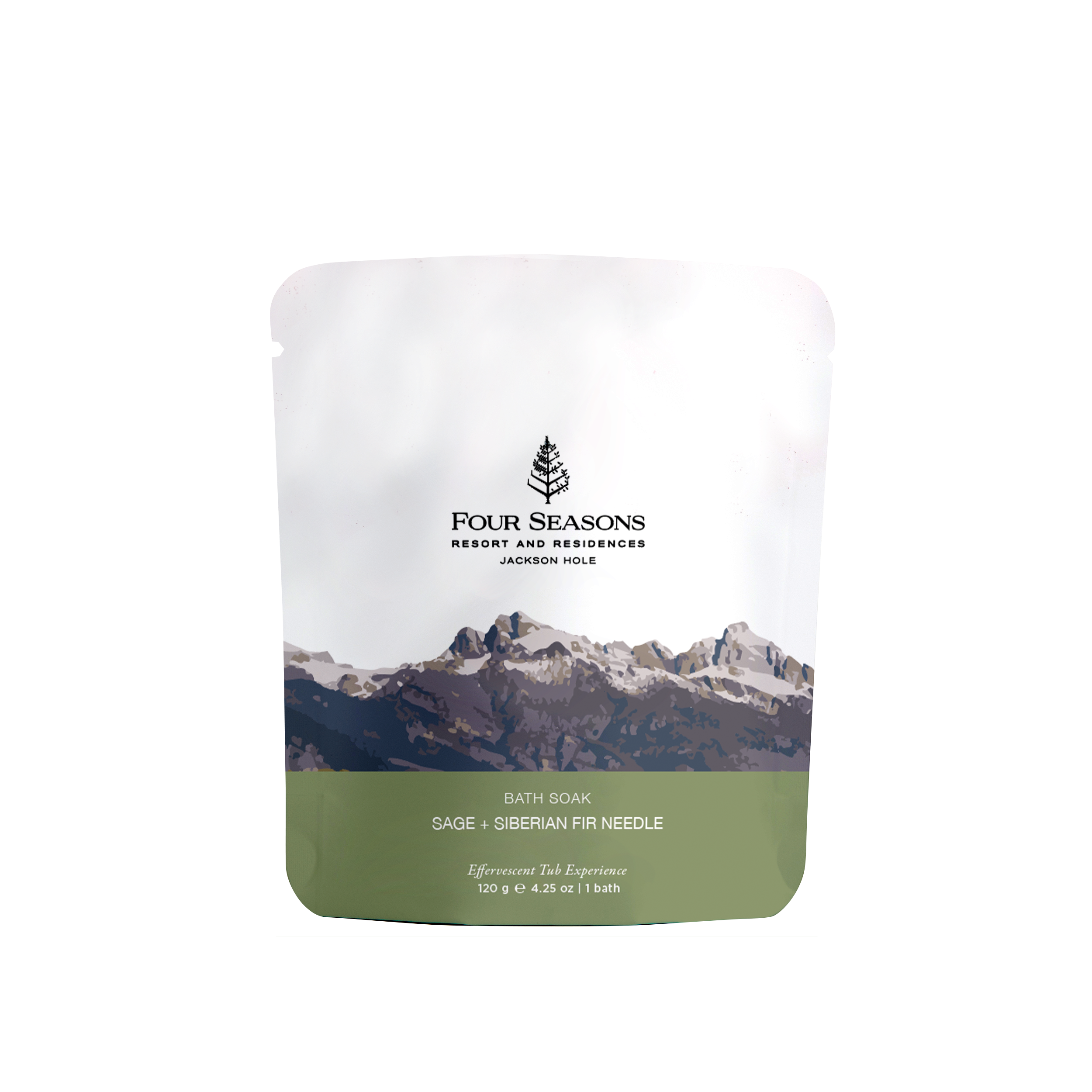
This concept uses a stylized mountain landscape to immediately ground the product in place, drawing inspiration from the surrounding environment of Four Seasons Jackson Hole. The earthy neutral palette paired with sage green accents reflects the soak’s scent profile—sage and Siberian fir needle—while reinforcing a sense of calm, nature, and luxury.
The structured composition balances premium simplicity with visual storytelling, allowing the landscape to act as both a focal point and an emotional connection to the resort experience. This direction emphasizes authenticity, relaxation, and a strong sense of place.
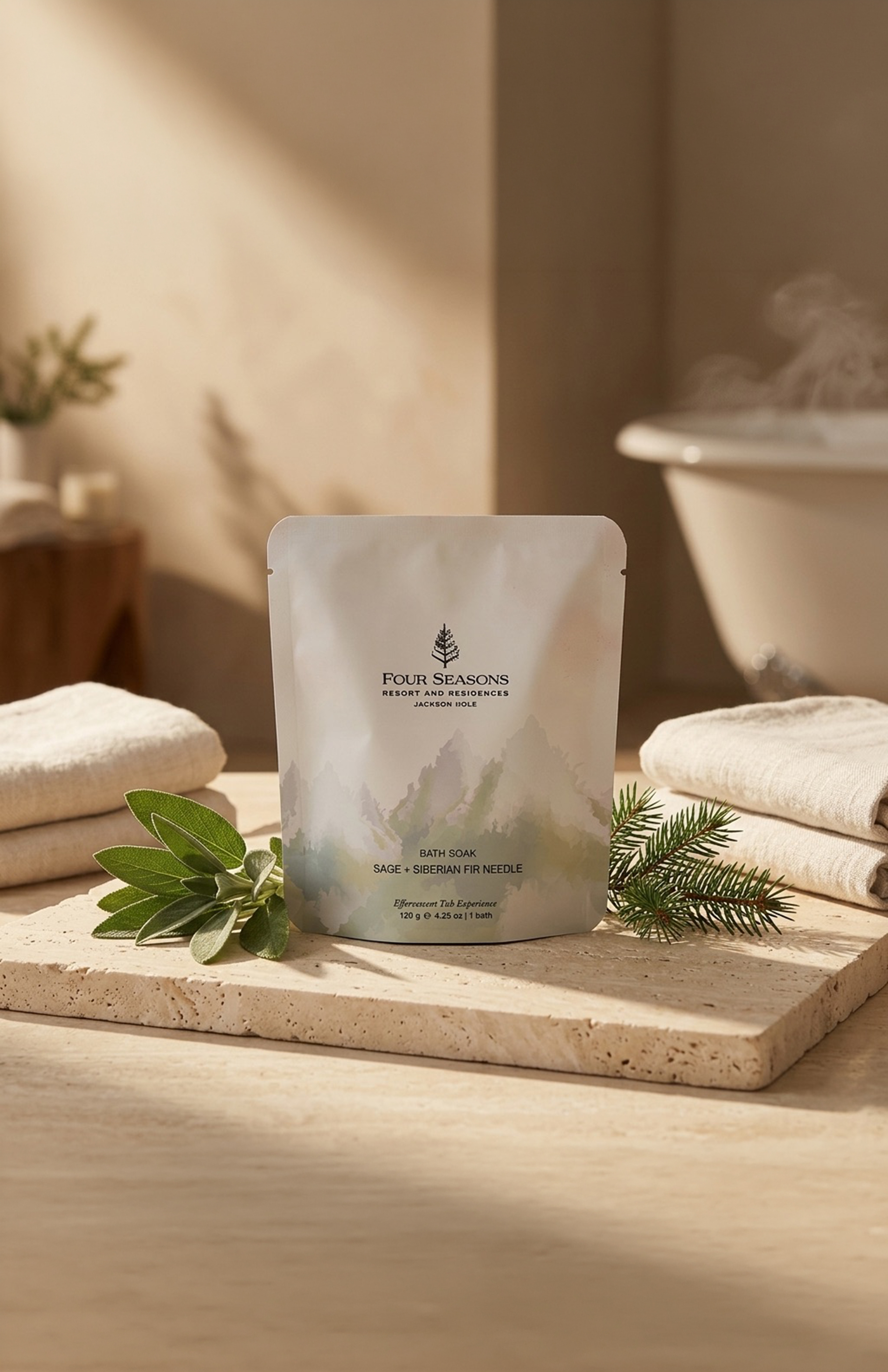
This concept takes a more abstract and delicate approach through layered watercolour-inspired mountain forms. The lighter palette and painterly textures create a calming, spa-forward aesthetic designed to evoke softness, restoration, and quiet luxury.
By reducing visual density and embracing negative space, this direction leans into a more elevated wellness experience while maintaining alignment with Four Seasons’ premium identity. The result feels airy, calming, and intentionally understated.
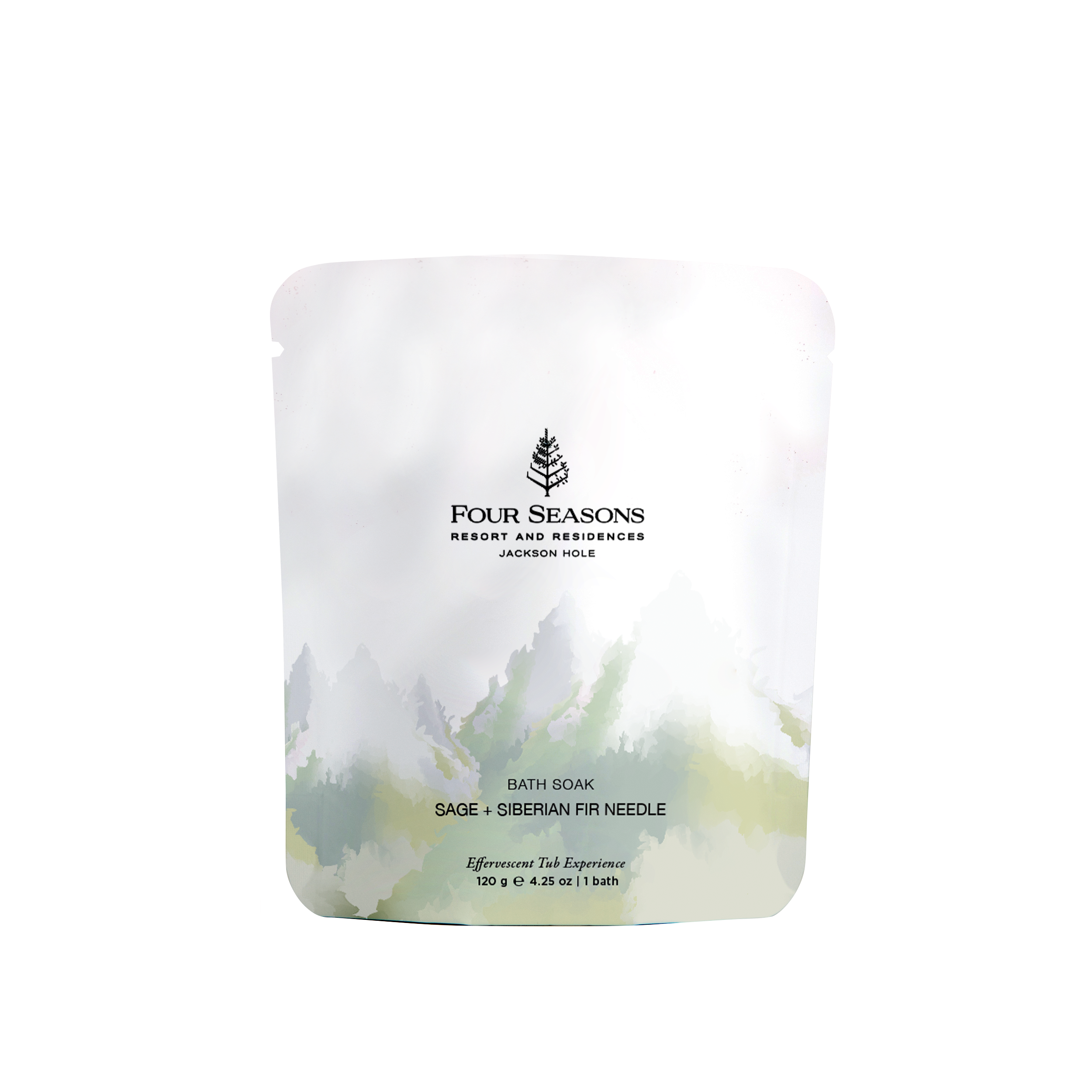
This concept takes a more abstract and delicate approach through layered watercolour-inspired mountain forms. The lighter palette and painterly textures create a calming, spa-forward aesthetic designed to evoke softness, restoration, and quiet luxury.
By reducing visual density and embracing negative space, this direction leans into a more elevated wellness experience while maintaining alignment with Four Seasons’ premium identity. The result feels airy, calming, and intentionally understated.
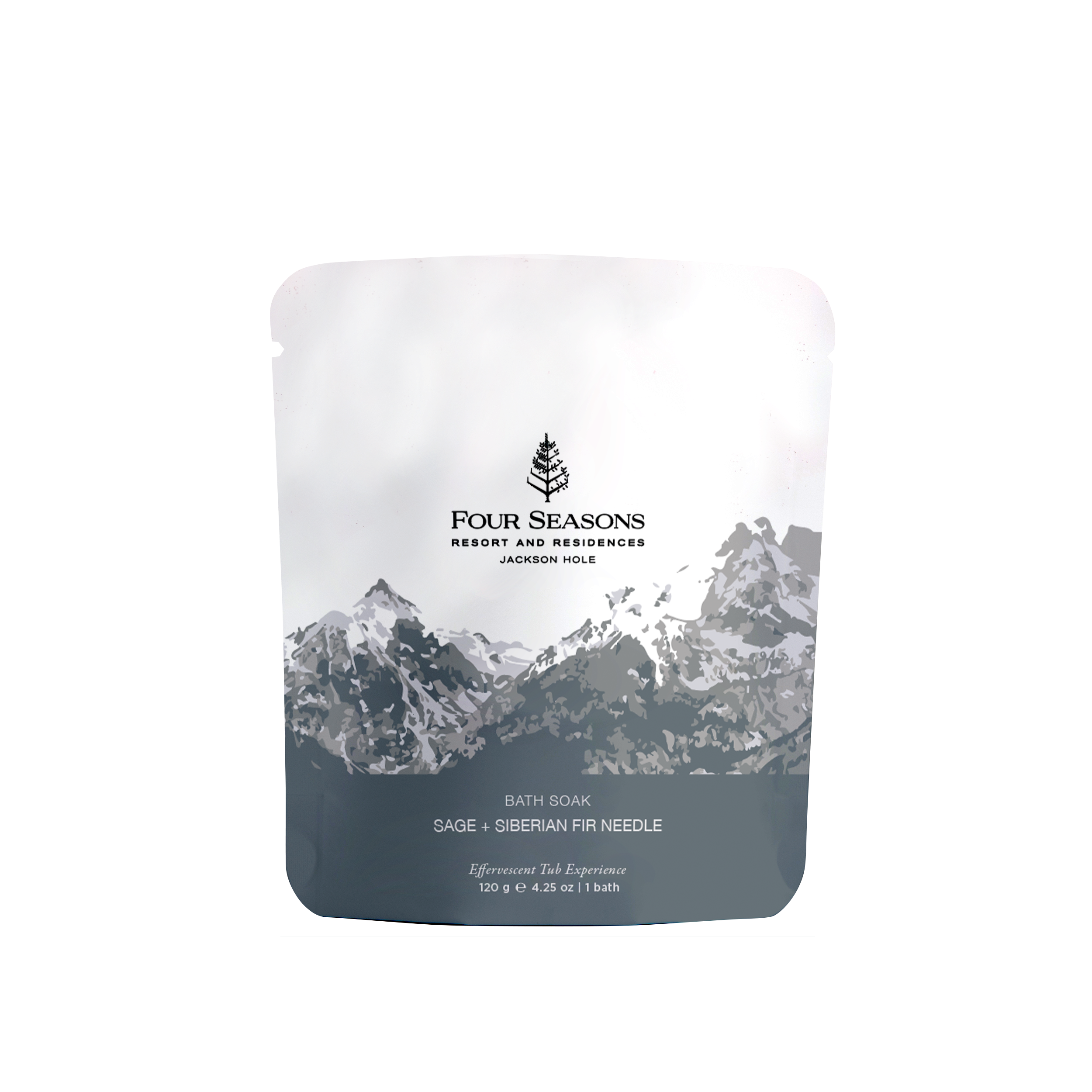
The final deliverable included three complete packaging concepts that explored different possibilities for a Four Seasons private label rebrand. The project demonstrated an ability to translate brand values into tangible visual systems while balancing creative exploration with practical packaging considerations. Through this process, the concepts offered a foundation for future brand evolution and visual consistency within the product line.